Tough times create focus.
The shelter-in-place has distilled life down to some of the pure joys that we rushed through pre-covid. A breath of fresh air, a cup of coffee, a work day in pajamas, shopping online.
Direct-to-consumer brands and ecommerce in general has seen a huge uptick — consumer spending in the United States is up 30% Year over Year for March through mid April, according to Rakuten Intelligence.
One new thing that I am now shopping for is buying coffee online. I’ve never done so, but I thought it’d be a good experiment to go through the process of purchasing, with the critical eye of a nitpicky marketer.
Ideally this can highlight some of the small yet important details that can help ecommerce merchants improve their customer experience and drive more sales.
In this post, you’ll see examples of:
- How a personalized experience can create an amazing experience, and more customers
- How design contributes to sales
- How emotion and storytelling can recreate what is
- How NOT to follow up with Abandoned Cart emails
The Overview
With an Andrew Jackson in my hand (that’s a $20 bill, I know it’s been a while since we’ve probably handled cash), I start my search for a tasty bag of coffee beans that can be delivered to my house.
Like I said, i have never done this before, and have no idea of what companies are out there. So naturally, I go to Google:
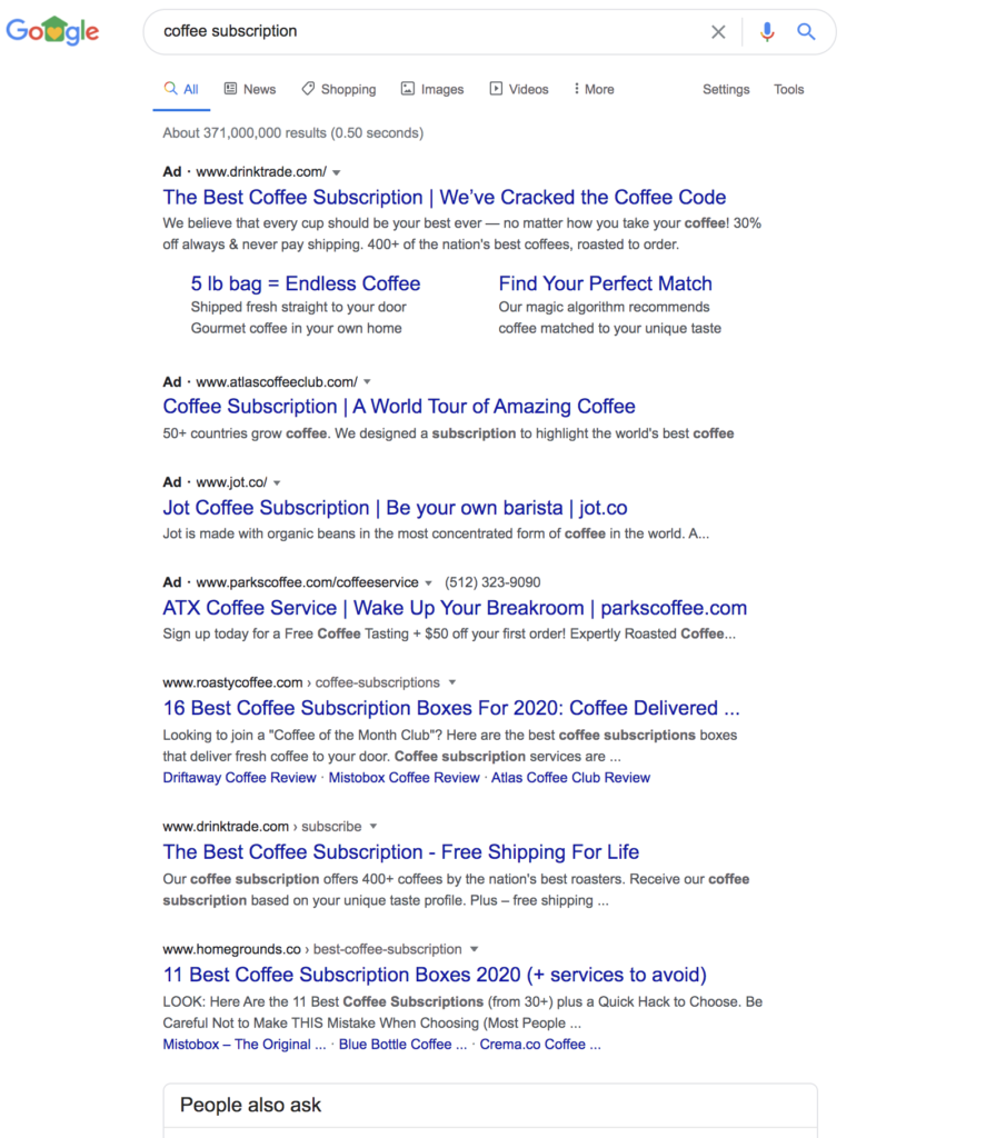
There are three companies that are bidding on this term, “coffee subscription”:
Coffee is a fascinating case study for ecommerce marketing.
Here’s why:
- The main advantages are not possible: Selling coffee online means that you have to convey taste, smell, and overall experience through copywriting and visuals. Visitors therefore purchase (or don’t purchase) based on how well the website can play to these sensations.
- Coffee is a commodity product: There are alternatives everywhere for getting coffee–from the super market, local coffee shop, or even drinking pre-packaged bottled coffee. So it’s a competitive field, and the visitor therefore must have a compelling reason to purchase.
- A low-cost product: for companies that are running paid ads to drive awareness and acquisition, they may be losing money on the initial few purchases. More on this later in regards to the funnel. Regardless, there is not a lot of margin for error for those companies that are running paid ads, so there should be some meaty marketing lessons in their funnel.
The User Experience
The first step of course is to check out their website. Let’s take a look at each website to get a first impression.
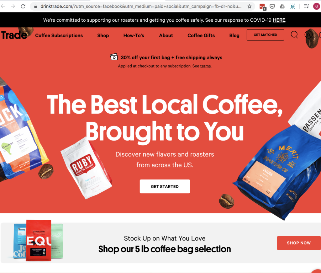
Trade’s landing page:
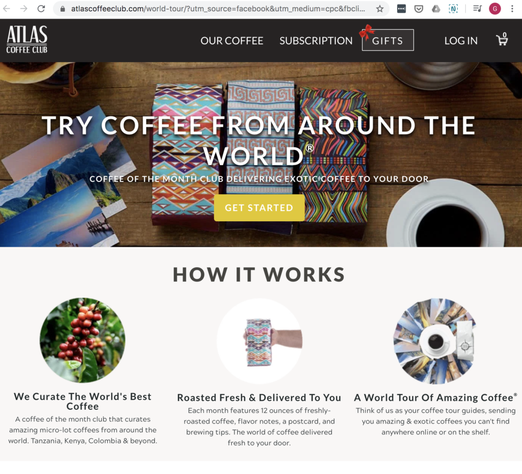
Atlas Coffee:
Craftwork Coffee:
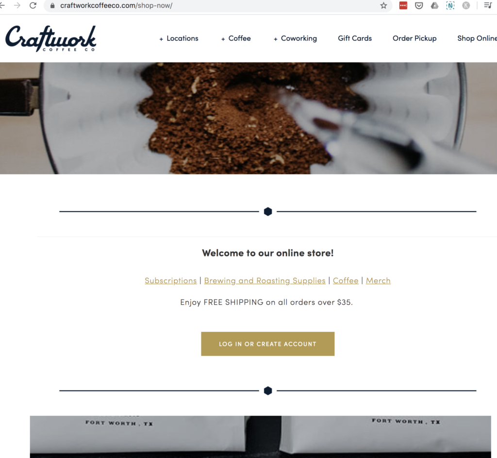
What do you notice?
Remember, that my goal was to find a convenient (and safe) way to try new coffees, delivered to me.
The verbiage that strikes me as most compelling is Trade: “The Best Local Coffee, Brought to You. Discover new flavors and roasters from across the US.”
I think that the Atlas text is on the mark as well, but not as impactful to me.
The nuances are small, but “Best” And “Local” capture my desire for looking for a delicious cup of coffee. And “brought to you”. I mean, these days there is nothing that can get a sale faster than home delivery.
Moreover, a quick scan through each site reveals a few things that Trade does, while others fall short:
- Photos of people – humanizing the product, beyond just an inanimate bean or bag of coffee, creates a subtle human connection to the product and company.
- Communicating Energy Through Color – Coffee naturally evokes earth tones, like browns and tans. Trade goes with a bright splash of red and a vibrant design. This is the type of energy you are looking for with your coffee, right?
- Cool parallax effect on homepage – Well, you’re just going to have to try for yourself
- Show the product “in the wild” – Remember, customers don’t by drills, they buy holes. Likewise, they don’t buy the coffee beans, they buy the complete experience–croissant, caffeinated energy, delicious flavor.
- Images > Words — just look at the “How It Works” — big images, few words, and representative images. Atlas Coffee on the other hand focuses mainly on the coffee, in different stages — bean, bag, and brewed. More text doesn’t necessarily deliver the same oomph, so to speak.
- Situational awareness with Coronavirus – There is nothing that is more top-of-mind than coronavirus, and how it impacts public health. So seeing the banner at the top of Trade’s website stating, “We’re committed to supporting our roasters and getting you coffee safely. See our response to COVID-19 HERE” tells me that there is thought behind their actions.
Here is the statement–which intentionally or not–makes me want to purchase from Trade even more:
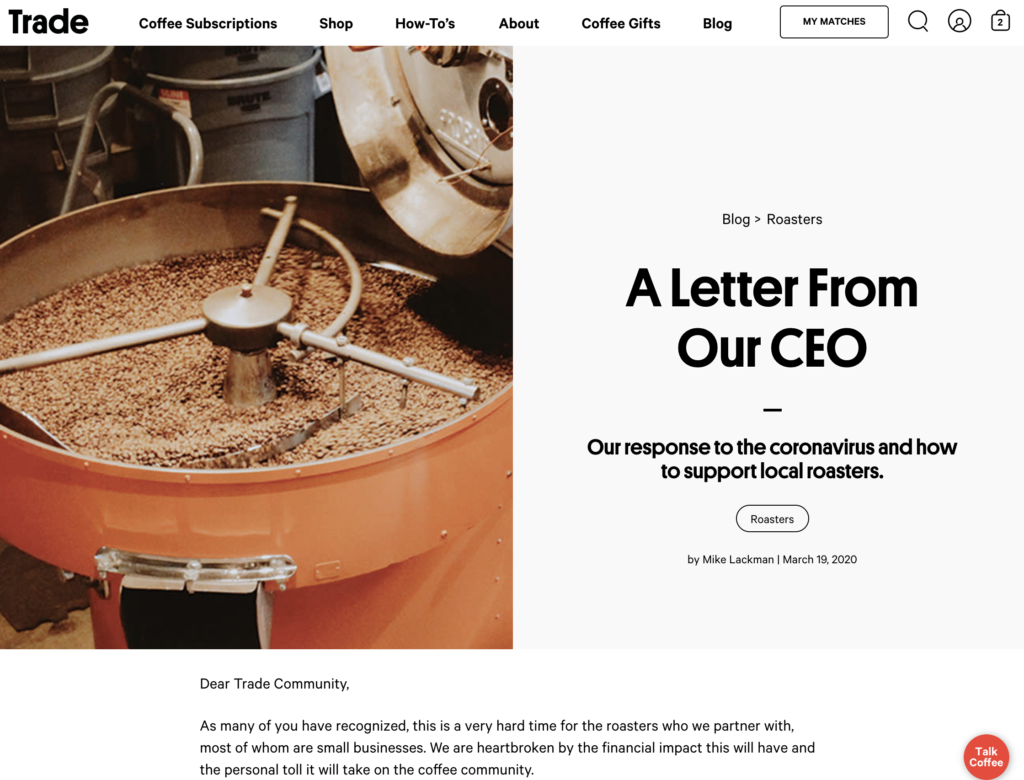
Trade is reinforcing the fact that purchasing from them is supporting, not detracting from, local coffee shops. Right on!
The Takeaway: Humanize your product: how it works in its real context. A steaming cup of coffee with a flaky croissant communicates more than a bag of beans or unroasted coffee. Moreover, humanize your company, especially now in light of coronavirus and how you are reacting and supporting your community.
The Copywriting
The challenge with marketing coffee online is that it is taking a highly sensory experience, and conveying the power of the product through visuals and text. No small task.
However, the challenge distills down to the challenge that all marketers face: capturing emotion, painting a picture of how the product can improve your current circumstance, and deliver me to my desired end state.
And with coffee in particular, the story behind the product is so important, especially if they are selling to the discerning consumer willing to pay premium prices. Fair trade, shade-grown, sustainable. All of these things matter in convincing us that the product is worth the cost.
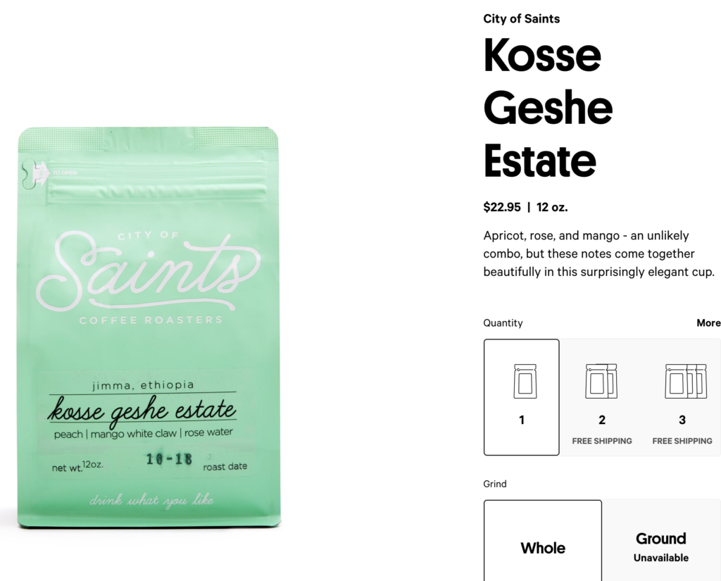
As a point of comparison, here is the product description for an Atlas Coffee product. Trade takes a more visual approach, Atlas a more text-heavy and descriptive path:
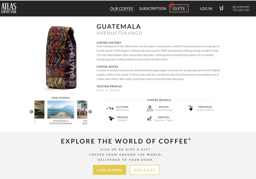
The Takeaway: Less is more. Viewers don’t want a paragraph to describe the flavor of a coffee. A few lines is sufficient, especially with accessible metaphors to things that we can all relate to.
The User Experience – Product Selection
Choosing the right type of coffee can be an overwhelming experience. If you’re like me, then price point is the main consideration. And then the roast–light roast for me (I think dark roast tastes like rain water in an ashtray).
But that is just scratching the surface.
Trade has multiple call-to-action buttons ushering visitors to take their “Onboarding” quiz, in the header navigation bar, hero image, and multiple places on the homepage:
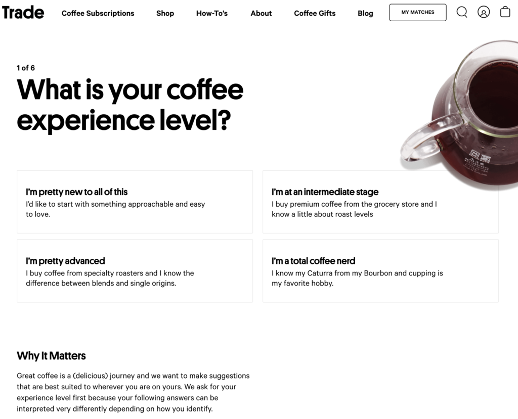
And what follows is an intuitive, clean, and enjoyable experience guiding me to the ideal product. “Part art, part science”, they say.
Out of curiosity, I went through this quiz multiple times just to see what the outcomes are (would they all lead to one of three options?).
User experiences like Trade’s quiz are a solid solution to this scenario: a wide variety of products, each suited to a different customer profile. Matching the right product to fit the customer’s preferences is crucial to creating a great customer experience.
By contrast, Atlas Coffee takes a different approach–users fill out some high level preferences like quantity, frequency of shipments, and roast type, and grind type. From there, Atlas just sends coffee on a regular basis.
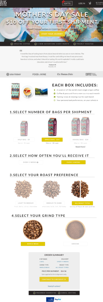
In terms of convenience, this experience is sufficient. But as a consumer, I feel like my purchase is more personalized and suited to my tastes after completing the quiz that Trade has.
And there is data to that confirms the value of personalized recommendations. In a Salesforce study of 150 Million shoppers, shoppers who clicked a recommendation comprised just 7% of visits, but drove 24% of orders and 26% of revenue. Recommendations help visitors find, and purchase, products. And they spend more during each purchase, and likely over the course of their customer lifetime.
The Takeaway: Find fun and simple ways to learn more about your visitors. A quiz, with relevant product recommendations, is a good way to do so.
The Checkout Process
I decided to purchase from both Trade and Atlas. Or actually, I added both to my cart, started the process, and decided to wait. How would each company address the challenge of abandoned carts?
Abandoned Cart sequences are a must-have for ecommerce businesses, with a substantive amount of revenue recovered through the channel. Recovery rates differ based on the Average Order Value, but can be anywhere from 3-10% recovery rate.
The Multi-step Checkout:
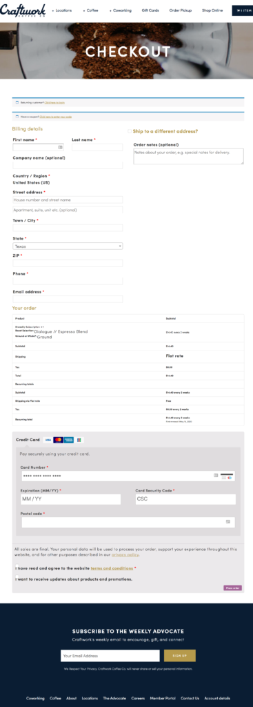
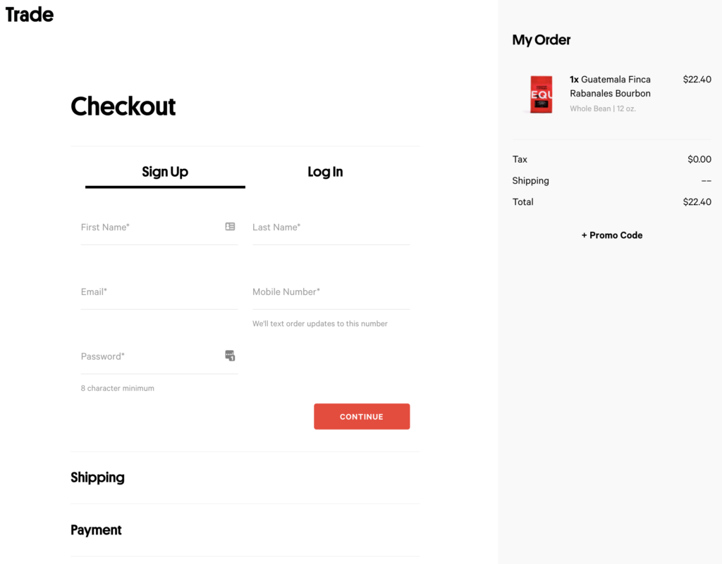
There is a small yet important difference between the checkout process of Trade and Craftwork, and that is having a single-step checkout vs. multi-step checkout process.
And the difference can make a huge impact on conversions and revenue.
Take a look at Craftwork’s flow (single step checkout):
And Trade (multi-step checkout):
See that?
Craftwork has a long form, one that requires basic info, billing, and shipping information to be completed all at once. If a visitor does not complete the whole transaction at once, then any chance of direct communication via email is lost. Any chance of recovering the lost sale would have to rely on remarketing campaigns.
Contrast that to Trade, which captures name and email first. THEN, billing and shipping. So if I hesitate, or get distracted in this process, at least they have my contact information for follow ups.
Craftwork does not have that opportunity for any abandoned cart emails.
And this could amount to 3-10% of all visitors who bailed at the last minute.
The Takeaway: Have a multi-step checkout flow to capture emails, in case a purchase is not completed immediately.
The Abandoned Cart Emails
Trade has the right intentions with their abandoned cart efforts, but the execution falls short.
Within 30 minutes of leaving the Trade website without purchasing, I received this email:
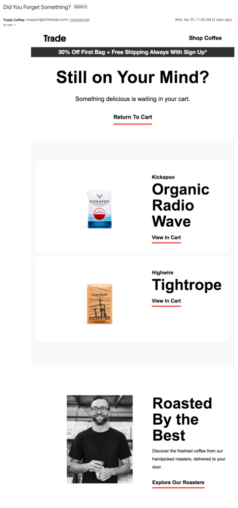
Yes, thanks Trade, in fact the coffee is still on my mind! There’s a reminder of exactly what is in my cart, and an easy link to get right back to finalizing the purchase. But unfortunately, this is where I ended up…..
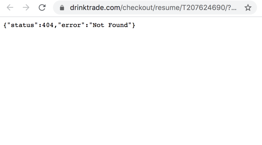
Impossible to know how much this has impacted revenue, but most likely something. This is likely a quick fix, but the takeaway is to monitor metrics regularly. If Abandoned Cart revenue tanks, then a quick investigation would likely uncover this technical glitch.
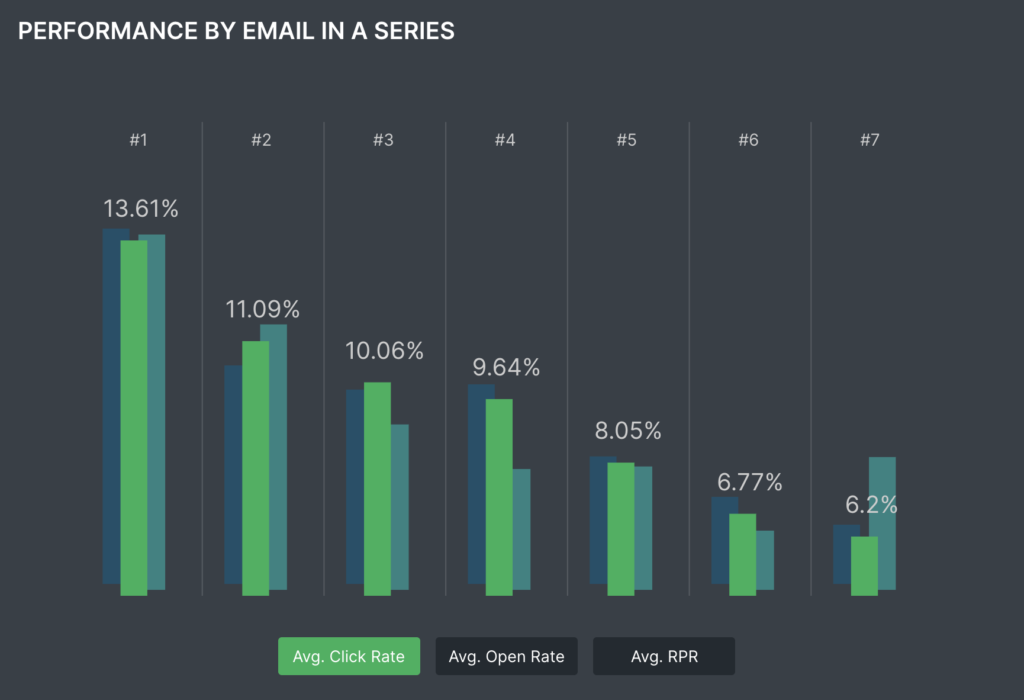
Trade was certainly persistent in their pursuit of me purchasing:

This is a good strategy, as open rates for Abandoned Cart emails still hold up, even after the 7th one. But as you’d imagine, the best chance of an open and click through are after the first attempt. Here’s the data from Klaviyo
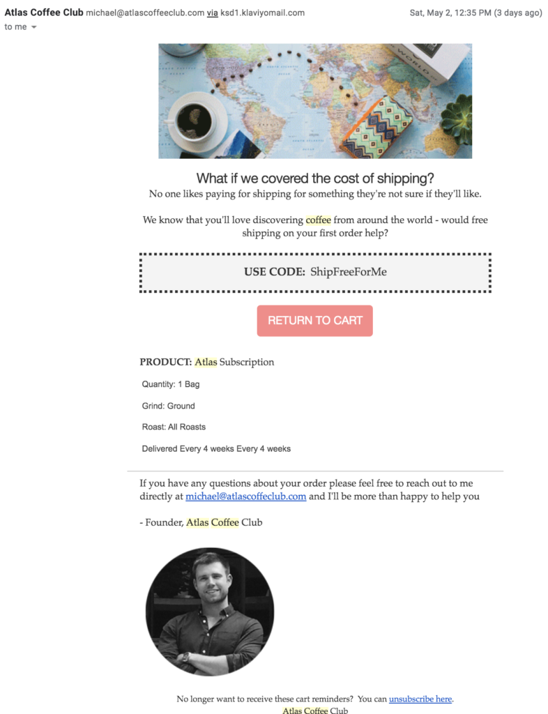
There is one thing that Atlas Coffee did here that is better than Trade, and that is simply changing their messaging and increasing the value of completing the transaction:

Whereas Trade makes the assumption that I simply forgot, and need more (and more) reminders, Atlas increases the incentives by offering free shipping. And it’s not that Free Shipping was already included and they are simply sending a reminder, but it is in fact a real offer:
The Takeaway: Regularly monitor performance of revenue per channel. If there is a sudden drop, investigate for where there may be a failure in the system. And try unique messaging and increasing offers of value to incentivize a customer to take action on Abandoned Cart emails.
The Follow Up Purchase Experience
In addition to the two abandoned cart emails that I received, another opportunity to help me finalize my purchase is running paid ads.
Trade did take advantage of that, with this ad that I received in Facebook:
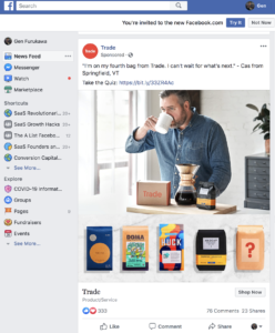
Right intention, but maybe still opportunity to improve the execution.
How?
They could further refine their remarketing campaign, knowing that I am more than just a visitor. I have selected items, and added them to the cart.
So an ad could dynamically insert the product that I have in my abandoned cart, and remind me to complete my transaction, while reinforcing the benefits that I am forgoing by not completing my purchase.
A quick check of their Facebook Ads Library shows some of their ad copy, which is visually engaging and has different value propositions (though none seem to be specific to abandoned carts).
And as any good strategic remarketing campaign would, there is a multi-channel approach to completing transactions. This is a skippable preroll ad that they are running on Youtube, in addition to Youtube banner ads.
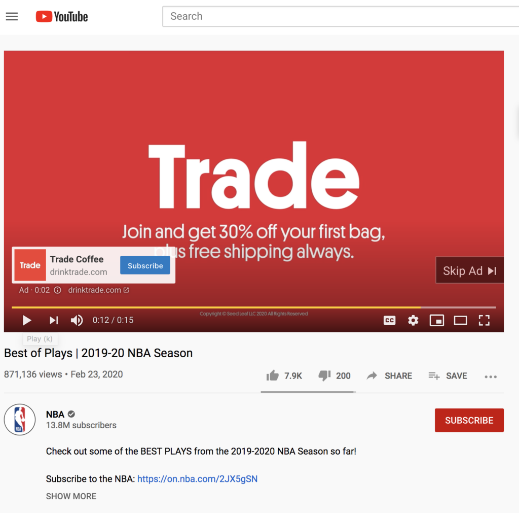
The Takeaway: Create appropriate messaging for different parts of the funnel and customer journey. Leverage dynamic content as much as possible to heighten relevancy.
OK, so now that we’re talking about paid ads, let’s take a further look at what the funnel metrics may be.
The Breakdown of The Funnel
The other important metric you need to calculate for your funnel is acquisition costs. How much does it cost to gain one new customer.
Let’s use the Google ad that I clicked on. The average Cost Per Click for this search is $2.

Let’s assume that a company is able to convert 1% of visitors to customers. Isolating just the paid traffic segment then, it would cost $200 in ad spend to convert one customer at $20 revenue.
If you look at that isolated conversion, then it is a 10% Return on Ad Spend ($20 in new revenue divided by $200 spent to get that revenue).
If coffee were a one time purchase, then the unit economics would make no sense. But coffee is obviously a repeat-purchase type of product. So how much is an acquired customer worth?
To arrive at Customer Lifetime Value, you need a few inputs: what the average order value is, and what the average lifespan of a customer is (measured by number of purchases).
Lifetime value obviously hinges on some huge variables. “Garbage In, Garbage Out”.
So just for fun, let’s assume that it’s 2.5 years, which seems like a reasonable time to stay with a subscription coffee service–you like the convenience, the exposure to new flavors, but then guilt tugs at your heartstrings and you realize that you can support the coffee shop on your block. So after 30 months, you churn out.
You have thus contributed 30 months at $20 per month, for a $600 lifetime value. Note that this is top line revenue.
The Takeaway: Have detailed calculations, and thresholds, on how much you can profitably spend to acquire customers. Ideally, you have a cost per acquisition per channel, so that you can maximize your most efficient channels and then proceed to those that are less efficient.
What Helped Me Decide To Buy
I miss going to coffee shops–the smells, the people-watching, enjoying the flavor changes as the coffee moves from scalding to tepid. Even the awkward squeezes into tight spaces to enjoy this experience next to a complete stranger. Alas, those were the pre-covid experiences.
So the substitute now is a good cup of coffee, and the anticipation leading up to that coffee.
In short, it is about the experience.And that is why the small things ultimately added up to create a great experience in purchasing from Trade:
- The Personalized Experience: The fun interactive “Onboarding”
- The Website Design: The funky and lively design
- The Follow ups: Remarketing ads on Facebook and reminder emails help close the sale
- The Story: Trade crafts a great narrative, from the origin of the beans, to the local roaster, to the flavor that I can anticipate.
- The Emotion: Trade highlights their support of local coffee shops, which I know have been especially hard-hit in the pandemic.
Normally I would breeze through the experience, and these thoughts may flicker but pass quickly and become subconscious thoughts.
Ultimately, this comes down to the marketing of Trade.
And for simplicity’s sake, let’s take Seth Godin’s definition of marketing: “The primary purpose of marketing is to create change in the world; meaningful, positive change.”
Trade is convinced me that it would make a positive change in my life–delivering the coffee, and the experience, that I wanted for $20.
And moreover, even more powerfully now, Trade promises to change the narrow corner of the universe that is local coffee shops effected by coronavirus and the supply chain related to it. That’s a story that I want to support with my money.
Cheers!

