In a week where most Americans are on edge waiting for the results, let’s take a completely different approach to selecting between two options….
User experience.
The first law of Steve Krug’s guide to user experience: don’t make users think.
Users should immediately know what to do on your website.
a confused user does nothing (except get frustrated and leave).
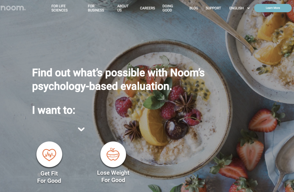
So why does weight loss app Noom have two equally-sized call to action buttons in their homepage?

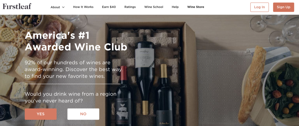
and DTC wine club, First Leaf, also has two buttons:

The trick is that both buttons take the user to the same page: their quiz.
Thus, these aren’t call to action buttons per se, but actually the first step of the quiz itself.
And theoretically, users are happy to engage because the questions incite curiosity.
Each of the headlines creates a “curiosity gap”—intrigue and interest are teased just enough to want the user to see what this is all about.
This is the first step, the first “micro conversion”, that gets a user steamroling through the quiz, enter an email, and sign up. Importantly, both Noom and Firstleaf rely on the data gathered in the quiz to create the user’s profile and the subsequent customer experience down the line.
For Noom, it’s understanding health goals, demographics, and habits.
For Firstleaf, it’s the preferences in wine flavor, expertise, price, etc…..gathering this data is imperative in order to create a monthly shipment that the customer will love every single month.
And by including two paths towards the same destination, perhaps these brands are increasing the likelihood of getting users to start the quiz experience.
How can you incorporate curiosity and micro-conversions to move your shoppers through to your desired end goal?

