I recently received the best email I have seen in a long time.
Personal, humble, helpful.
It had the warm informal tone of a friend.
And offered advice of a trusted advisor.
In one email, consumed in under a minute, I’m primed to purchase.
The email smoothly brought me through the purchase journey and addressed key purchase triggers:
- Establish Trust
- Create Motivation & Desire
- Reduce Friction & Save Time
The email is from a The Farmer’s Dog — “a service that delivers balanced, freshly made pet food with simple recipes, guided by science, and driven by love.”
Here’s the email, sent from the CEO and Co-Founder:
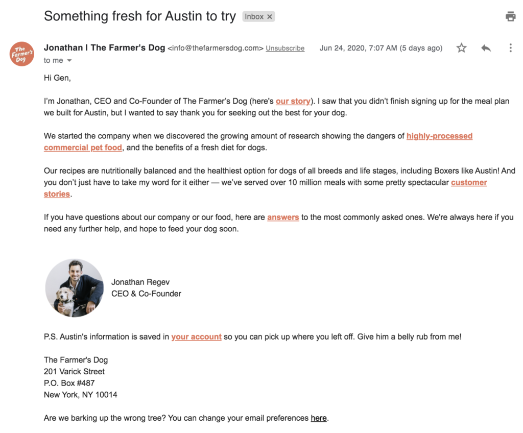
Let’s break down why it is so good:
Takeaway #1: Establish Trust
The main goal of this email, the first interaction with me as a potential customer: establish trust.
Jonathan shows that he understands and cares.
There is acknowledgement for my efforts as a dog owner–that I am making an effort to seek out the best for my dog. This highlights the company’s mission: to feed dogs the best food possible.
Some phrases that subtly build rapport and demonstrate that Jonathan (and by extension the whole company) genuinely care:
- “the meal plan that we built for [your dog’s name]”
- “thank you for seeking the best for your dog”
- “we’re always here if you need any further help”
- “give him a belly rub from me!”
There is also a link to a 3 minute video segment on the company’s mission and how it started. It was produced by CBS News (a credible media authority), and has 14k views:

More importantly, it shares the backstory of the brand while showing how the food is made. We can see the kitchens where the food is prepared, an office filled with happy dogs, and “meet” the founders in person. This reinforces the fact that yes, The Farmer’s Dog prepares dog food that a human can actually eat!
Takeaway #2: Create Motivation and Desire
“We started the company when we discovered the growing amount of research showing the dangers of highly-processed commercial pet food, and the benefits of a fresh diet for dogs.”
This sentence follows the Problem – Agitation – Solution framework.
Introduce the problem that I’m experiencing.
Reinforce the severity and urgency of the problem.
Then introduce the solution to the problem.
Which goes something like this:
Problem – Processed commercial pet food
Agitation – this food is dangerous — filled with toxins like arsenic!
Solution – nutritionally balanced and the healthiest option for dogs of all breeds and life stages
This email also includes the name of my dog (Austin), and the breed (Boxer). This type of use of personalization is sophisticated, because it subconsciously addresses objections that these foods are not ideal for my dog.
Address Potential Objections
Because this is the first email that I have received from the brand, and I am just learning about their offer, I may not be completely sold at this point. While I have completed key milestones in the purchase process (completed a form, opened an email), some questions may remain.
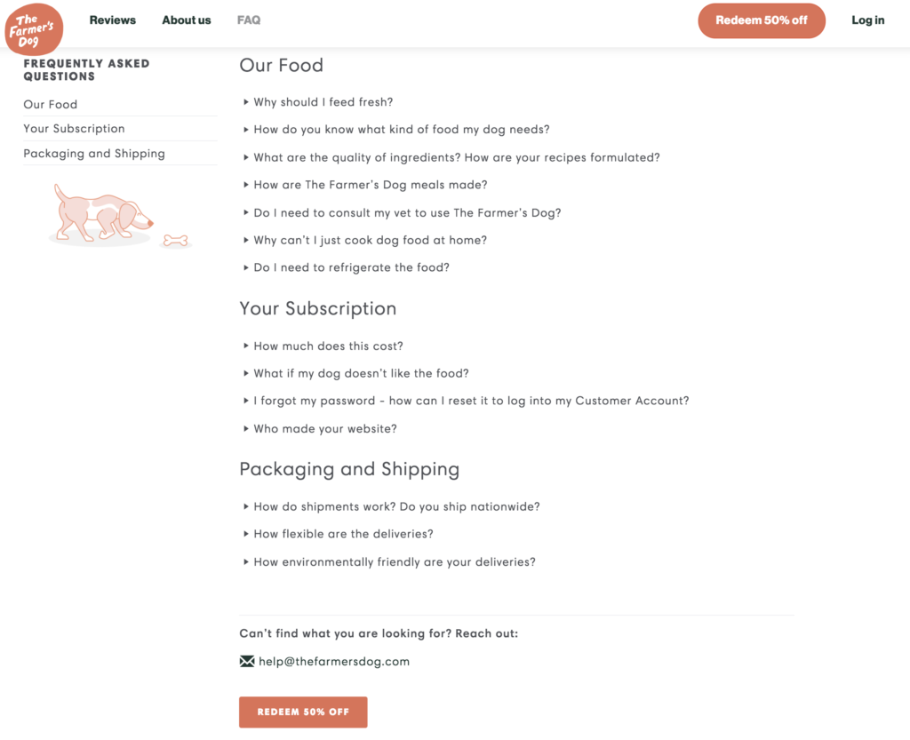
The Farmer’s Dog FAQ page is thoughtfully designed to answer lingering questions about the food, pricing, shipping and more.
And the page has two clear call-to-actions to purchase, incentivized with a 50% off coupon:
Takeaway #3: Reduce Friction
In a few short paragraphs, I have been introduced to the people and mission behind the brand, and why their product is important to me.
The last, and most important step of course: the purchase.
In the PS section, there’s one last important call-to-action: log in to the account.
The Call-To-Action is strategically placed in the PS.
It is called the Zeigarnik effect: “It’s when we feel uncomfortable if having incomplete tasks and, therefore, trying to complete them as soon as possible to defuse that tension. And it’s what happens to your email readers: they start your marketing email from P.S. to find the call to action and complete it”.
Thus, the PS is an effective place to include a message that you want your audience to see.
And in this case, it directs me to the most important step–completing my transaction.
Clicking on the CTA brings the shopper with one simple choice–what size to order:
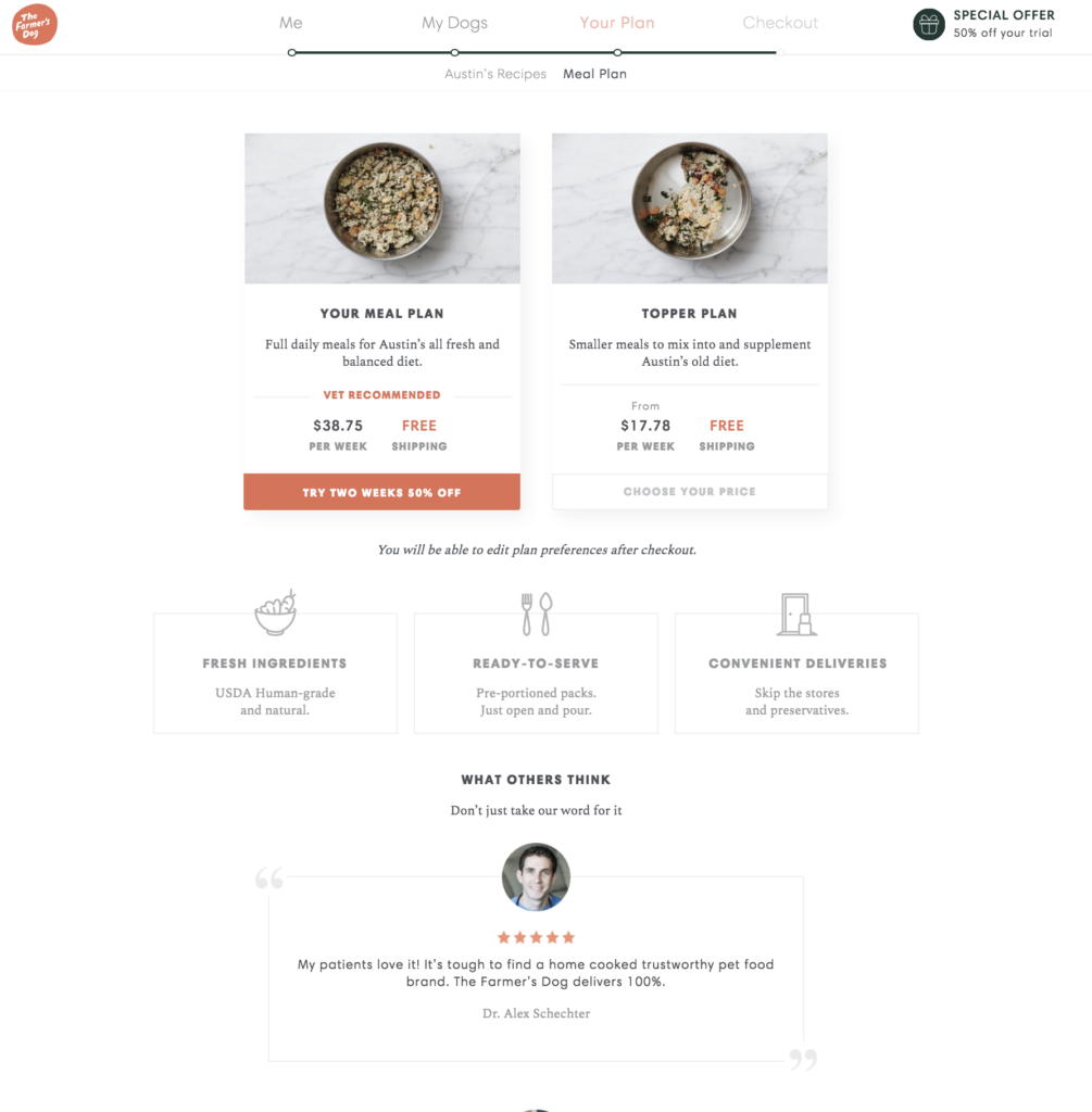
Notice that this Product Page also includes Austin’s name, reinforcing the personalized approach that define’s The Farmer’s Dog. This is a recipe designed specifically for my dog’s dietary needs!
When used correctly, product recommendations like this can increase the average number of items in the cart by 68.14% and increase conversion rates by an incredible 320% per Barilliance.
How Did Farmer’s Dog Create This Experience (And How You Can Too)
The Farmer’s Dog created a unique experience that takes a few simple data points and uses that to build a rapport and personalized product recommendation.
It all starts with a quiz.
The homepage has six calls to action for users to take the quiz. Each button on the homepage (with a different call to action, “Start Today”. “See Your Recipes”, “See Your Price”, etc) leads to the quiz. It is most important step for new visitors to complete, so that they can enter the email funnel and receive the personalized email outreach and recommendations:

The quiz is three simple steps:
Me – info about my dogs, location, contact information
My Dogs – my dog’s age, weight, breed, body type, activity level, health, and diet
Plan – a customized diet specific to the dog’s profile
Quiz Part 1: “Me”
Part 1 is filling out basic information about me, the customer (but not the end user, which is my dog!).
The quiz starts in an empty state: the first question is how many dogs. It is often best to start with simple questions that do not require any thought or information that I might be hesitant to share, like my email address.
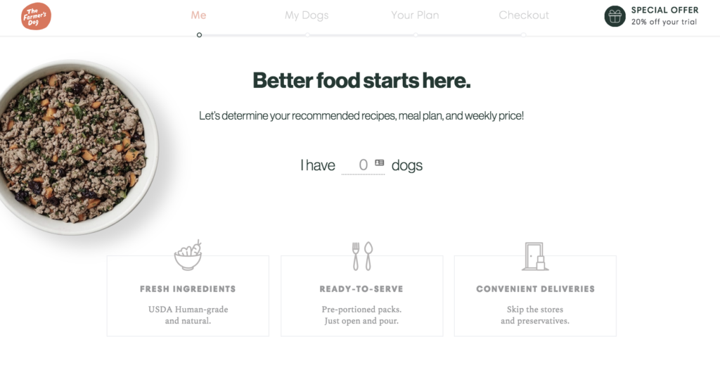
As I answer each question, I am prompted with another question. Once I complete these micro-commitments and have engaged in some level, I am more disarmed to share more personal information:
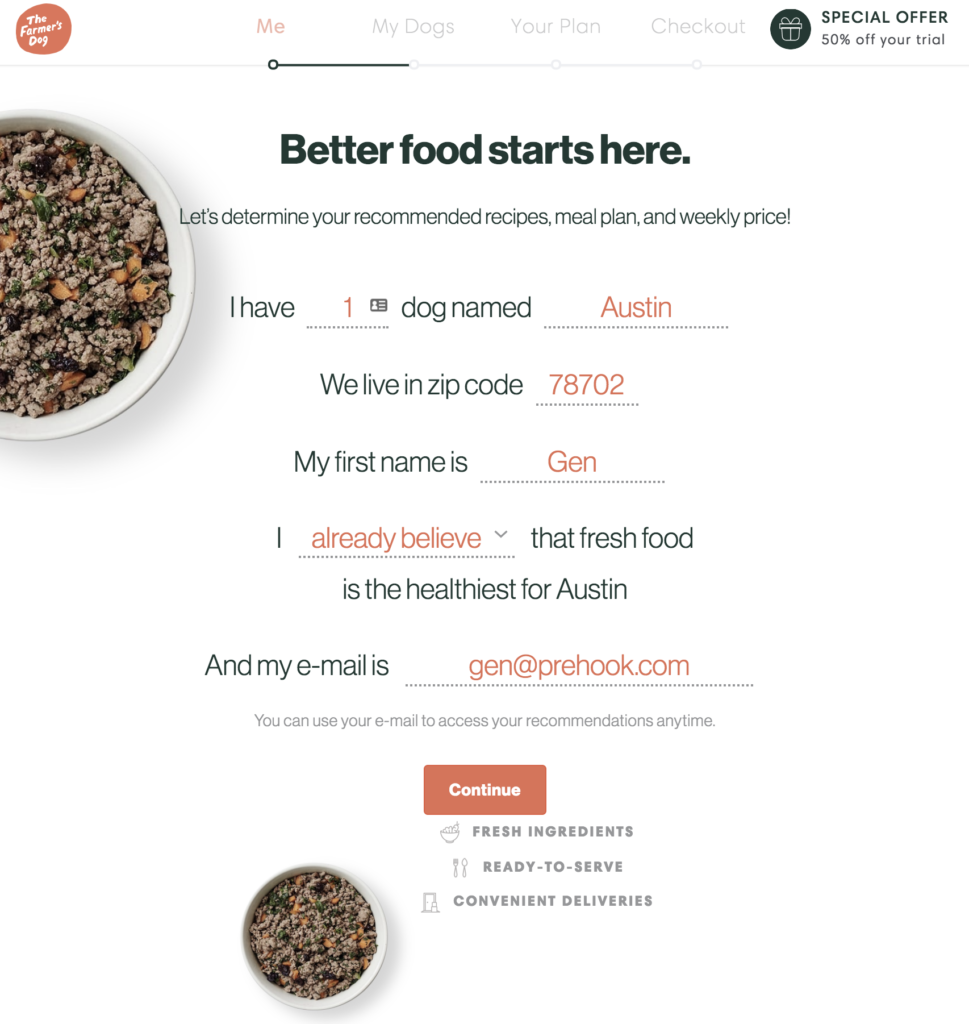
Before I realize it, I have completed the critical information that allows my profile to be segmented in several important ways.
Interestingly, there is a question about my current beliefs about healthy food–the Farmers Dog marketing team now understands how to communicate with me. Am I already a believer, do I need to be convinced? This correlates to where I am in the funnel–gathering information (top of funnel) or convinced and ready to purchase (bottom of funnel)?
The screenshot below shows all of the information filled out,
Quiz Part 2: “My Dogs”
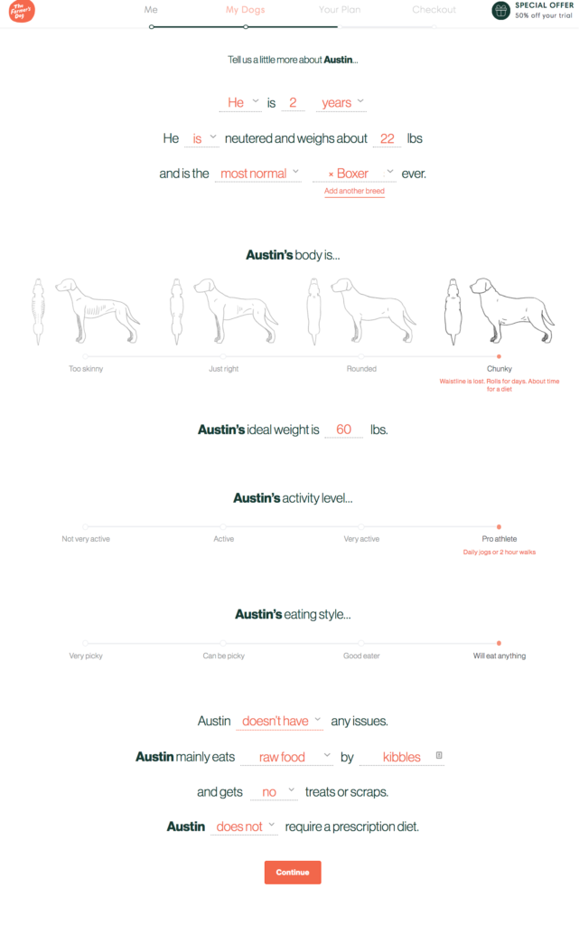
The second part of the quiz is about the dog. The questions appear dynamically–as I complete each question, the next question appears.
This does two things: first, it makes the quiz seem less overwhelming, if there is only one question to answer, and not a whole page of blank questions waiting to be answered. Thus, there is likely a higher completion rate. Secondly, it keeps the quiz engaging and fun. Remember, the mindset of the person filling out this quiz is that of a loving parent, and searching for the best solution to feed their beloved pet.
Here is the quiz with all questions completed.
Notice the “recall”–using data gathered in the actual questions. In this case, it is my dog’s name, Austin (confessional: I don’t have a dog, but do live in Austin, Texas and loved this user experience so wanted to share it with you!):
Quiz Part 3: “Your Plan”
The last part of this quiz process is the product recommendation.
This is the magical part of the customer experience–after completing the questions based on my dog’s age, weight, body type, activity level and more, I am presented with a “plan as unique as Austin”. The page visualizes the food that is offered, states the main benefits (convenient healthy options) and nails the point home with user reviews and media mentions:
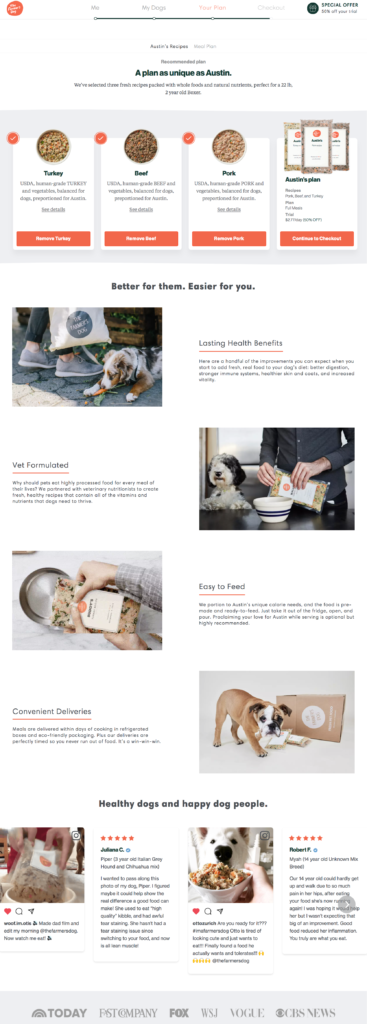
Farmer’s Dog has clearly built a beautiful product and sophisticated recommendation engine.
It is a thoughtful process to hook shoppers in to the mission of providing beloved pets with healthy food, and more convenience. This is ultimately their value proposition, peppered throughout the site: “Better for them. Easier for you.”
The company has raised $49 million, and served millions of dog meals already. But that funding is a result of their previous successes.
The strategies that Farmer’s Dog use can be replicated on a shoestring budget:
- Use a quiz to capture key customer data — contact info, shopper’s challenges and goals, etc
- Create personalized email campaigns that incorporate that information
- Build an emotional rapport by sharing your story, your key benefits (and how it differs from alternatives)
How are you gathering your audience’s needs and desires to create personalized offers?
You don’t need $49M like Farmer’s Dog to offer a personalized experience.
We’re busy building it now: interactive quizzes to delight your customers and drive more sales.
Sign up to get early access for free!

